The Apple of my eye (revisited)
A long term review of the Apple Watch Ultra
I bought a FlipBelt recently. For those who don’t know what that is, it’s an elastic sort of cummerbund waistband for snugly carrying small items—keys, an energy bar, or a phone—while running, skiing, or any other activity where you don’t want stuff bouncing around in a pocket or a backpack. Finally, I have a good way to carry my iPhone when I go running. I really only use the phone for streaming music to my AirPod ear buds and, I suppose, a measure of safety if I come across an accident or get hurt or lost. And sure, the odd selfie. Why do I bring this up? Because the arrival of the FlipBelt spells the end of my long term review of the Apple Watch Ultra. I’ll explain shortly. First, some background.
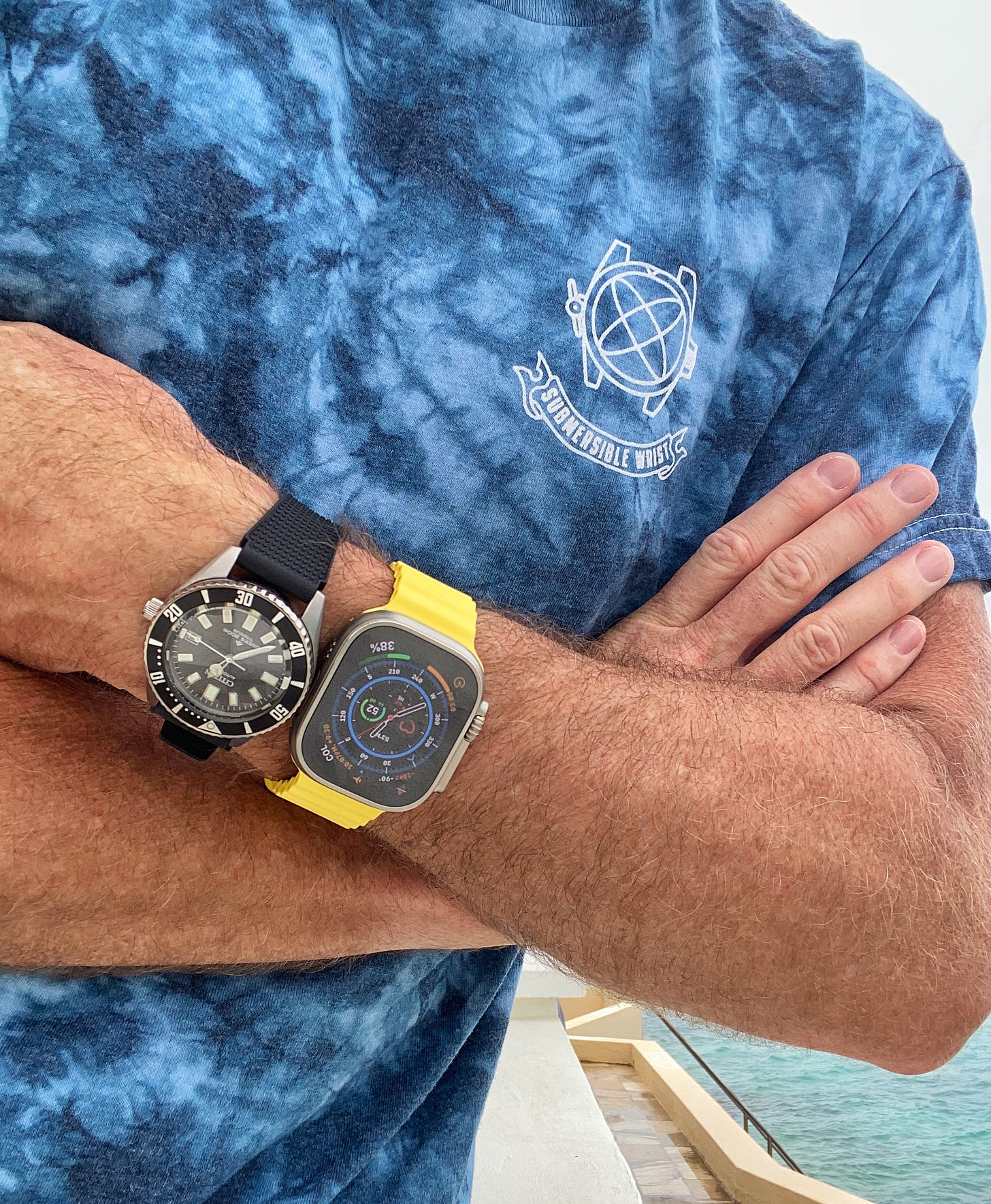
As you might recall, I received a press sample Apple Watch Ultra back in early October, with the goal of using it for all the activities for which it was touted. The watch, made of aerospace titanium with decidedly rugged and evocative strap choices, good water resistance, some adventure-focused features (enhanced navigation, a loud SOS siren, and glove-friendly buttons), and better battery life than the regular Apple Watch, was hotly anticipated and often seen as Apple trying to take Garmin’s and Suunto’s lunch money. As a Garmin devotee, I was keen to try it out. I’d also never worn, much less handled, an Apple Watch, so wanted to see what they were all about.
I had a tentative commitment from a big tech publication to publish my review after some time with it, most keenly focused on the watch’s scuba diving capabilities, in concert with the Oceanic+ app developed for Apple by Huish Outdoors. This gig never materialized when the editor of said publication ghosted me (and Apple!), leaving me high and dry, so I decided I’d go solo with it, and use it for as many activities and daily uses as I could and capture my impressions here on Swimpruf and on The Grey NATO podcast.
Within a week of receiving my loaner Apple Watch Ultra, I was on a plane to my favorite Caribbean dive destination, Bonaire, for two weeks. It would be a suitable first testing ground for the watch. I could not only dive there, but also wear it running and open water swimming. The Oceanic+ app was not yet available though, so underwater testing was limited to the depth gauge function of the watch itself. This was fine for the shallow reef diving in Bonaire, as well as breath-hold dives. In reality, the so-called “120 rule” of no-deco diving can be applied when using a simple depth gauge and bottom timer. Subtract your max depth (in feet) from 120 and you get the time, in minutes, you can remain underwater (e.g., for a 60-foot deep dive you have about 60 minutes before you’d need to decompress). For repetitive diving there are some more calculations necessary, but for the lazy, twice-a-day diving we were doing, gauge mode would be just fine. Anyway, I was reviewing the watch, not a third-party app.
Within my first hour with the watch, I had flipped the crown position to suit my right-wrist position and signed up for a mobile package through AT&T so I could use the watch as a full-featured phone and mobile data device, untethered from wi-fi. Making that first call, sans phone, was a small thrill, living the Dick Tracy dream. I ended up not using that feature a lot, but just last week I was out running my usual 5k loop, my iPhone left on my desk miles away, when Gishani called to ask me something. Without missing a beat, I tapped the screen of the watch and had a brief, out of breath conversation through my AirPods. On another occasion, also running, I arrived at a friend’s house to drop something off (I love running errands) and messaged him right from the watch to tell him I was in his backyard. And a week later, I popped into the neighborhood grocery store to grab something. Again, no phone, no wallet—I paid for my purchase using the watch. So this is the ecosystem Apple Watch devotees love. I was finally getting a taste of the magic. It also, for me, was the biggest reason to like the Apple Watch (not just the Ultra): the ability to leave the phone behind.
I don’t mind carrying my iPhone most of the time. I find the camera immensely useful, not to mention the myriad other features. I can read a book on it while waiting for an oil change, measure a cabinet at Home Depot using the Measure app, or watch a YouTube video on how to correctly bleed hydraulic lines while hunched over an open engine bay. And, usually, carrying it isn’t a problem. I have plenty of pockets, even on my cycling jersey. But running is a different matter. Whether in summer wearing a flimsy pair of shorts and light t-shirt, or winter in tights and a vest, the phone becomes an unwieldy brick, throwing off my gait and tugging my pants down. In Bonaire, on my first run with the Apple Watch Ultra, I popped in my AirPods, opened up the Music app, started the running activity app, and off I went, unencumbered. It was incredibly freeing and I felt like I was getting away with something. I know what some of you are thinking—this was a feature on the standard Apple Watch, and you can even stream music on a Garmin watch. To the latter point, Garmin doesn’t have its own music storage app like Apple, so you have to use a third party service like Spotify (YouTube Music here), which I don’t use, and to stream would require mobile data. In Bonaire, I kept the watch on Airplane Mode to save on international roaming rates.
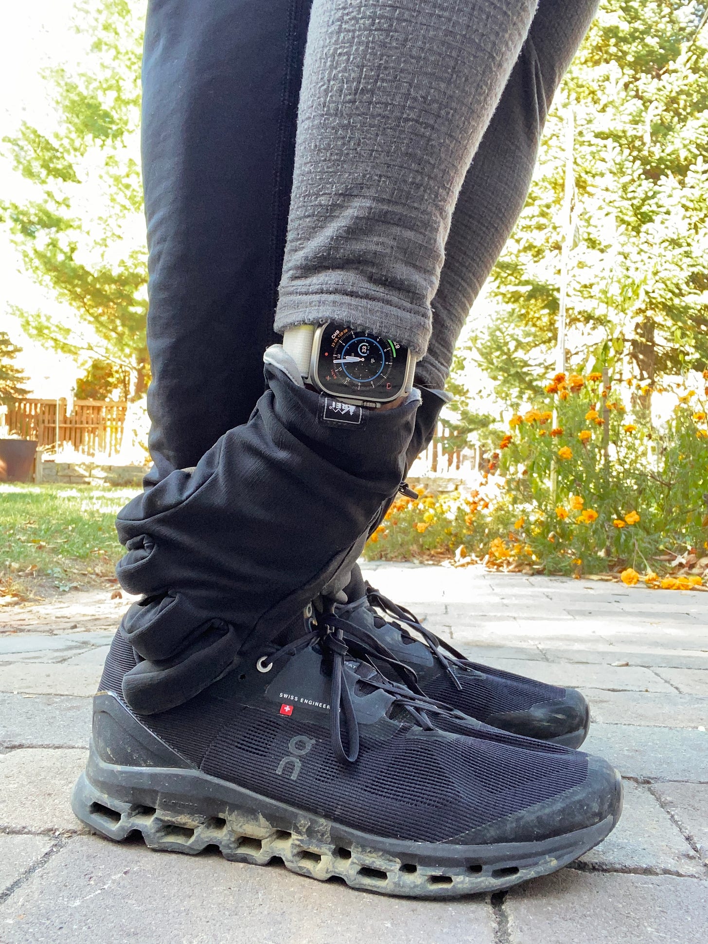
OK, so what about the Ultra part of the Apple Watch? Much has been made of the watch’s design. Functionally, it’s great—the large, symmetrical shape allows the aforementioned clever crown flip and it lends itself well to data display, as opposed to a round shape, where corner to corner simply isn’t possible. Titanium is a great material for a sports watch of any kind. It’s incredibly light on the wrist—corrosion resistant, tough, and doesn’t feel cold like steel does on the skin when the outside temperature drops. Combined with the pebble-like shape, it may be the most comfortable watch I’ve ever had on my arm. A lot of that is down to the straps too. The Trail hook-and-loop option is soft, stretchy and weighs next to nothing. The Alpine Loop strap is a little more scratchy and fiddly to adjust but once on, is comfy, light, and definitely looks the part for a watch built for adventurers. It consists of daisy-chain loops and a small hook, conjuring a technical backpack or climbing gear. And finally, the Ocean strap is a rippled soft silicone blend that was actually my least favorite strap, though it is best suited for wet work. It has channels for repositioning the metal keeper so the tail of the strap is never flopping around.
The big digital crown was easy enough to spin, even with gloves on, though I found it sometimes too sensitive to manipulate on the fly. The buttons on the sides of the case are responsive and a cinch to operate to start, pause, and stop workouts or access the app listing. The broad, bright touchscreen is very legible and has a clever night mode that turns to red on black for lower light reading without searing your eyeballs. But one of my biggest gripes is that, even with its impressive real estate, I still found the screen too small to tap the right icons, especially while in motion. To adjust volume, scroll views during a workout, or swipe while running, cycling or skiing was frustrating, and I usually had to stop to do it. Here’s where button controlled functions still rule, and Garmin is superior in this area, with intuitive menus and functions assigned to the five tactile buttons on the outside of the case for everything from dismissing a notification to browsing music on the fly.
One of the features Apple played up with the Ultra was the so-called “Action” button that can be assigned any number of functions, usually to start a workout or a playlist (or both simultaneously) so you don’t have to go through multiple steps to do this. In reality, while this may be new to Apple, again, I’ve been used to that on Garmins for years, where, once an activity is selected, pressing the Start/Stop button does what it says. I will say that, for activity tracking, wayfinding, and distance and speed calculations, Apple’s satellite acquisition time is much faster than anything I’ve experienced with Garmin watches. It’s almost instantaneous, whereas on my Garmins I’ve sometimes had to wait up to a minute for the GPS signal to lock on.
Aesthetically, the Apple Watch has never been to my taste and the Ultra hasn’t changed that opinion. Some find its smooth shoulders and integrated strap the pinnacle of modern design. I find it bland and lacking the warmth of more conventional watch case shapes. I’ve said it before, it looks like some sort of mass produced tracking and communication gadget issued to the brainwashed citizens of some futuristic dystopia (or maybe the future is now!). And the Ultra is simply a bigger version of that. Aside from the straps, there is also nothing about the Ultra that inspires me to go climb a peak or swim the Channel. It feels altogether urban and cerebral, more cashmere turtleneck than polarfleece and Gore-tex. But aesthetics are entirely subjective, and if form truly follows function, then perhaps the Apple Watch Ultra represents the natural evolution of the sports watch. However, I’ve often said that much of the appeal of a watch of any kind is to inspire one to get out and do cool stuff, and this one simply leaves me cold.
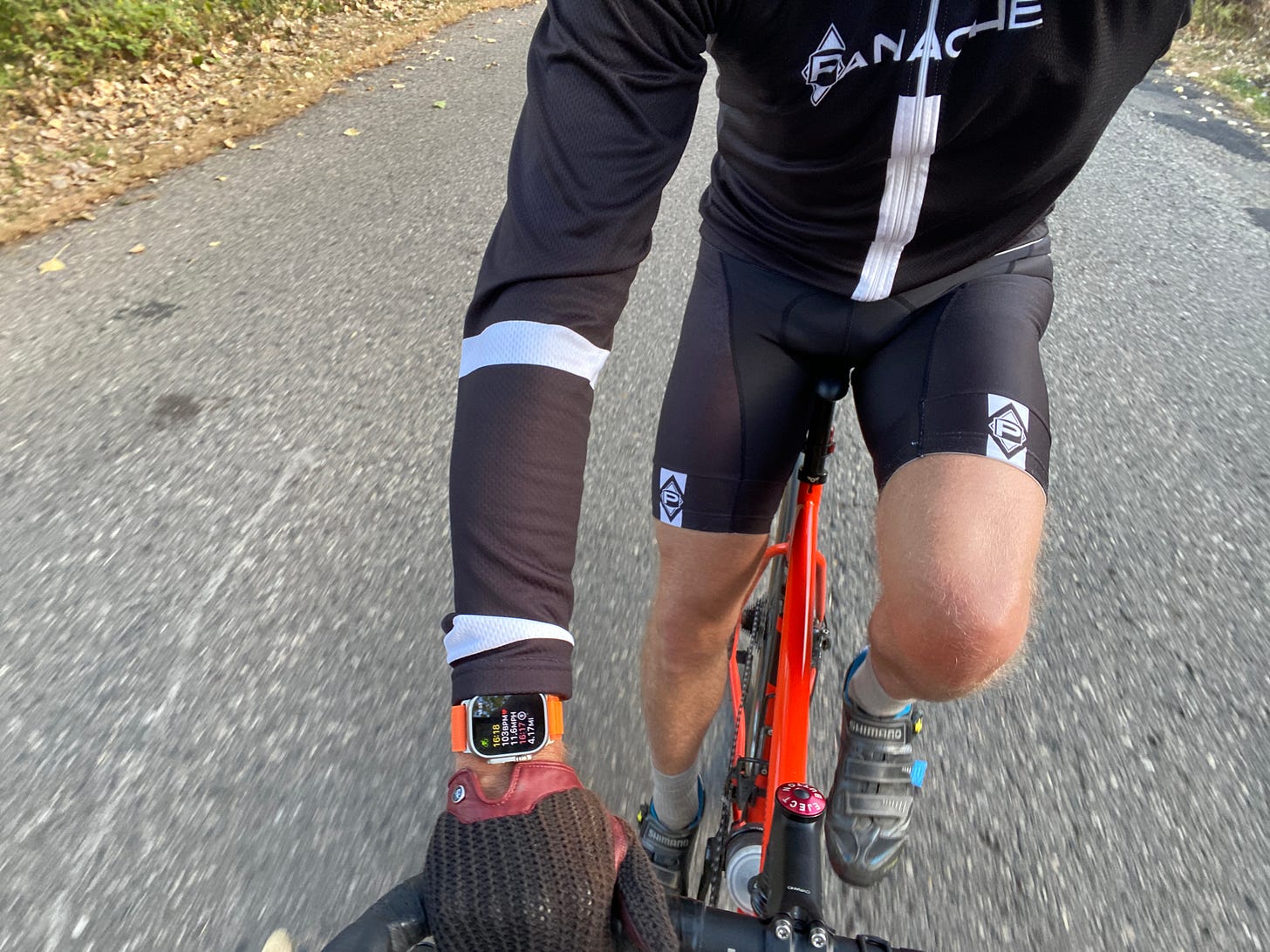
In use, I found it mostly intuitive, legible, and accurate but also unnecessarily complex in some situations or maddening at others. Running is how I’ve used it most. Starting a workout is a cinch with the Action Button, and even if you forget and find yourself a few blocks from home, the watch will even pipe up and ask if you’re running and should it keep tracking as such. But during the run, if I wanted to do anything besides view the statistics it’s tracking, it was difficult to see and perform. Just try to manipulate a tiny touchscreen while bouncing along, panting at 80% of max heart rate—it’s not easy. And then if you’re wearing gloves, like I have been since November, it’s impossible.
Open water swimming in the Caribbean was a similar experience. Once under way, it did a fine job tracking my strokes, heart rate, time and distance. But I quickly found that, if I was in the water for any amount of time before commencing my swim, the Ultra would turn on its “Water Lock” to prevent moisture from flooding the watch. This keeps you from being able to even start a workout until you press two buttons to eject water through the watch’s speakers (treading water, mind you). Again, score one for Garmin and its watertight buttons and ease of starting a workout.
Perhaps my biggest disappointment with the Apple Watch Ultra is its battery life. Much was made by Apple about its increased capacity versus the standard Apple Watch. If that’s the case, I truly pity those who regularly use an Apple Watch. I wasn’t even wearing the Ultra 24/7 and found that I had to charge it, if not daily, then every two days. Even sitting, screen off, between workouts on my desk, I’d find its battery percentage down to 60%, 37%, sometimes 16%, to the point where in order to strap it on for a 30 minute run required that I plug in the magnetic charging cable and twiddle my thumbs while it juiced up. Granted it’s a fast charge, but still, with my Garmins, I’m used to weeks of battery life, even in summer with long bike rides and runs almost daily.
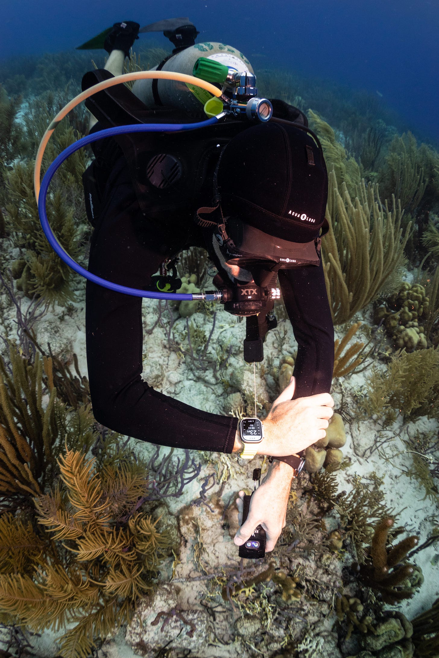
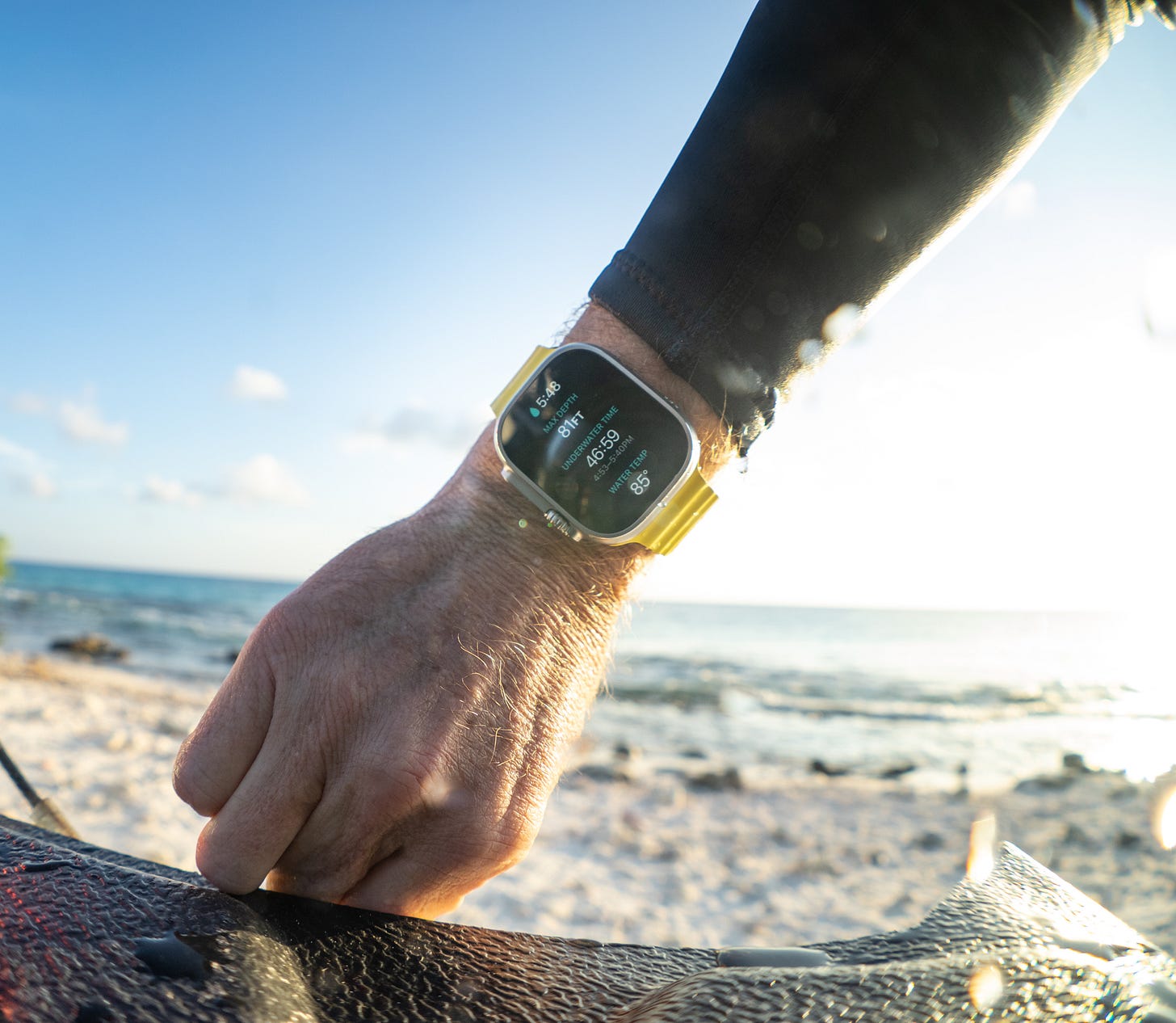
And what about diving? When the Apple Watch Ultra was announced, a common phrase I read was, “Apple made a dive watch!” This is not a dive watch. Nor is it a dive computer. It is a more water resistant, larger Apple Watch that can use a subscription-based third party app to perform basic no-decompression recreational dive tracking. On its own, the depth gauge function in the Ultra was impressive. It would start automatically under a foot of water and show a legible, intuitive display of your increasing depth in feet on one side, meters on the other, with elapsed time and water temperature. It’s great for apnea (breath-hold) diving, snorkeling or, as I mentioned above, occasional shallow recreational scuba. Now, I have not tried the Oceanic+ app, though I was given access to a beta test version (too late for use in Bonaire) and sat in on an explanation of its features by Huish Outdoors, the developer. But I can confidently say that I would not bother to use it, for a few reasons.
First off, the Oceanic+ app is subscription based. It costs $4.99 per day, $9.99 per month, or $79.99 annually. This is on top of the $800 price tag of the watch itself. The way I dive, sporadically, I’d be subscribing and unsubscribing all the time, for my weeklong dive trips a few times per year, or for one-off weekend outings in the Great Lakes. That would add up. It also seems a bit silly to have to add subscribing to a dive computer app to more important aspects of dive prep. By comparison, the Garmin Descent G1 Solar costs around $500 and is a fully functional, decompression/technical diving wrist computer with all the other sports activity tracking and connected features built in. The bigger, brighter, and fuller featured Garmin Descent Mk2 is about $1,000, the equivalent of an Apple Watch Ultra plus two annual subscriptions to Oceanic+. Cost aside, the subscription model for the Oceanic+ app seems clunky for the vacation diver, who would need to remember to re-up his subscription before going on a cruise or an annual Mexico holiday, in addition to digging his fins and mask out of the closet and finding his passport.
The Oceanic+ app is strictly for recreational scuba diving. I realize that the vast majority of scuba divers don’t exceed the accepted recreational limit of 40 meters, but the Oceanic app will actually bottom out at 44 meters and tell you to switch to a backup device. Why? Dive enough and soon you might find yourself dabbling in a little decompression or wanting to explore more advanced diving. I’m sure Oceanic could have built in more capabilities, so why didn’t they? Even the most basic Suunto dive computer (the Zoop) can calculate deco stops should you find yourself exceeding recreational limits. It’s akin to having the Running tracker limit users to 26.2 miles, so that ultramarathoners have to use a different device. My gut says there will be an enhanced version of the app (and likely the Apple Watch Ultra) down the road to entice users to upgrade. For my money, I’d skip the Oceanic+ app and just have fun with the depth gauge/bottom timer feature, then use a proper dive computer for serious scuba diving.
All these specifics about the Apple Watch Ultra’s features, foibles, and aesthetics are well and good, but for me, the bigger question is, how it fits my lifestyle. As you know, I am not a full-time connected watch person. I love my Garmins, but I use them like the tool watches they are: ride them hard, put them away wet, an hour or three at a time. They’re sports specific gear for me, like my ski boots, bike helmet, or dive mask. And they excel at this, not asking for more. The Apple Watch feels more needy. It wants to creep further into your life and integrate with your MacBook, your iPhone, your sleep cycle, your credit cards… For those who like the 24/7 (minus battery charging time!) use of a connected device, the Ultra is brilliant. You can do everything with it short of snap a photo (I bet that’s coming): wake to an alarm, check your e-mails, order groceries, play music, take a call, time your workout, check your heart rhythm, track a dive, and call for help. But then you give up your wrist real estate to something that looks like a medical device. This, combined with the feeble battery life, sometimes frustrating functionality, and limiting dive capability means it’s not for me. I’ve cancelled my mobile data plan, packed up the Apple Watch Ultra with its straps, buckled on my old Garmin, and tucked my phone into my FlipBelt. I’m going for a run. Then I’ll come home and put on a Seiko.




Excellent, thoughtful, truthful and informative.
Jason,
Another great piece of writing.
I haven’t coveted a Dick Tracy watch but I’m sure many folks do. The question for geezers like yours truly is when will that level of connection be required in every day life? Many vendors no longer take cash and I can see a time when vendors will design sales around the convenience of ApplePay and Apple Watches using 5G networks.
At that point...I suppose I will need that Apple or perhaps hire a college student to be my surrogate to the outside world.